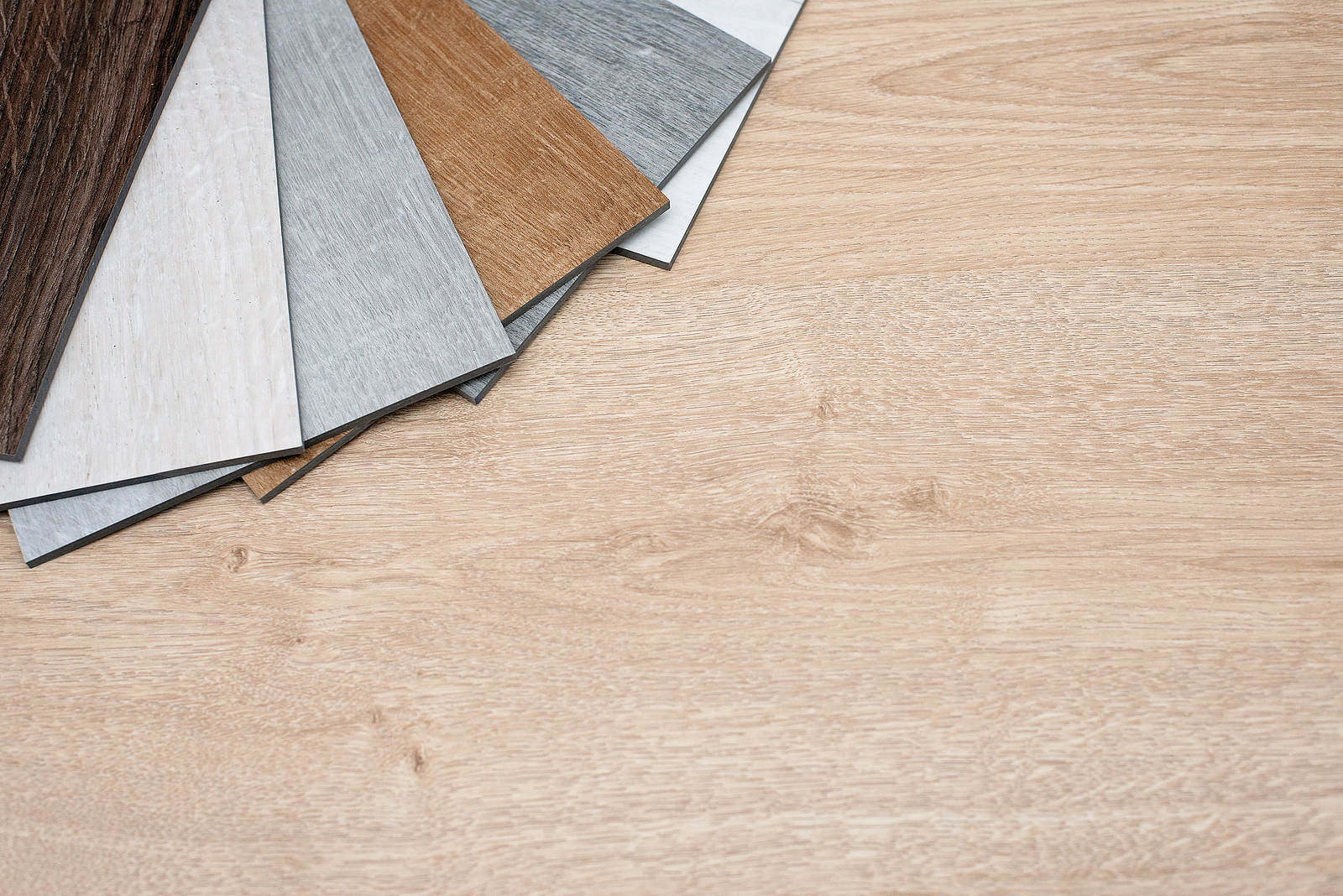
In comparison to wall-to-wall carpet rolls, the biggest benefit of carpet tiles is that they can be extremely easily replaced, and whilst this is good for maintenance and support reasons, it can also be used stylistically by both residential and commercial interior designers.
Tiled carpets can be used to create unique and striking patterns, can partition and portion specific parts of open plan buildings and can create distinct looks that can be applied seasonally without the huge disruption that would otherwise be necessary to take up an entire room’s worth of carpet.
This means that, should a building manager or interior designer be so inclined, they can decide to refresh the look of an office, retail space or residential building whenever they choose, and according to some interior designers, these are some of the colours that might be replaced.
White Carpets
White carpets are often connected with minimalist luxury living for a very good reason; whilst they look striking when they are new, it is very easy for them to get stained or simply lose their brilliant lustre.
This is true regardless of how much cleaning they are subjected to, and many office buildings will simply eschew them entirely.
Instead, the recommendation is a deep-coloured, traditionally luxurious replacement such as teal, burgundy or copper, as all three are far easier to maintain. This is often compounded with the naturally hard-wearing nature of most tiled carpets.
Beige
When white was impractical, the compromise was always an off-white shade of beige, as it could complement any type of design style but was less sensitive to the rigours of everyday use.
However, after decades of beige being a dominant look in both retail and commercial spaces, a somewhat fervent backlash has ensued, and whilst it can serve as a perfect platform to highlight colours and create striking accents, it can also be used to create somewhat boring, bland aesthetics.
It also has an issue of not being stain and wear-resistant enough for many offices, so many have swapped beige for deeper earth-inspired colours such as maroon or terracotta. They retain a natural, comforting style whilst having more texture to them.
Avocado Green
There had been a revival of 1970s Earth-inspired colour schemes, using dark browns and pea greens. Remarkably, as offices have shifted towards a more broadly biophilic design language, both dark browns and certain shades of green have started to be replaced in some interior spaces.
The main reason for this is that the trend for 1970s throwback interior design ultimately did not last as long as some designers expected, particularly for professional spaces such as offices.
The style worked when paired with 1960s and 1970s furniture with bold designs and an abundance of wooden texturing, but is far less effective with more modern furniture, fixtures and fittings.
Cold Grey Tones
Neutral shades are somewhat difficult to get right, particularly in an office setting, and much like with beige shades above, metallic grey shades have fallen out of favour for the opposite reason.
Whilst they are hard-wearing and do not showcase stains, with tiled carpets allowing for more affordable and cost-effective replacements, going to such extreme lengths in the name of functionality is no longer deemed strictly necessary.